Case study · Lead UX/UI
American Financing
As lead UX/UI designer at a national mortgage lender, I redesigned the marketing website, ran the direct-to-consumer landing-page testing program and rebuilt the borrower portal.
Overview
Lowering the load in a high-anxiety category
I worked across three major efforts: the marketing website, the direct-to-consumer acquisition funnel and the borrower-facing loan portal, plus a brand modernization that brought the color system into accessibility compliance.
Mortgage is a high-anxiety, high-jargon category. Across all three, the job was the same: lower the cognitive and emotional load with softer forms, friendlier visuals, fewer steps and clearer status, without losing the rigor a financial product demands.
Case study
A reskin that reads as a redesign
The constraint
Keep roughly 90% of the existing content and layout, but make the site feel modern. No rebuild, no re-architecture. I couldn’t move the furniture, so I had to change the light.
Softening the system
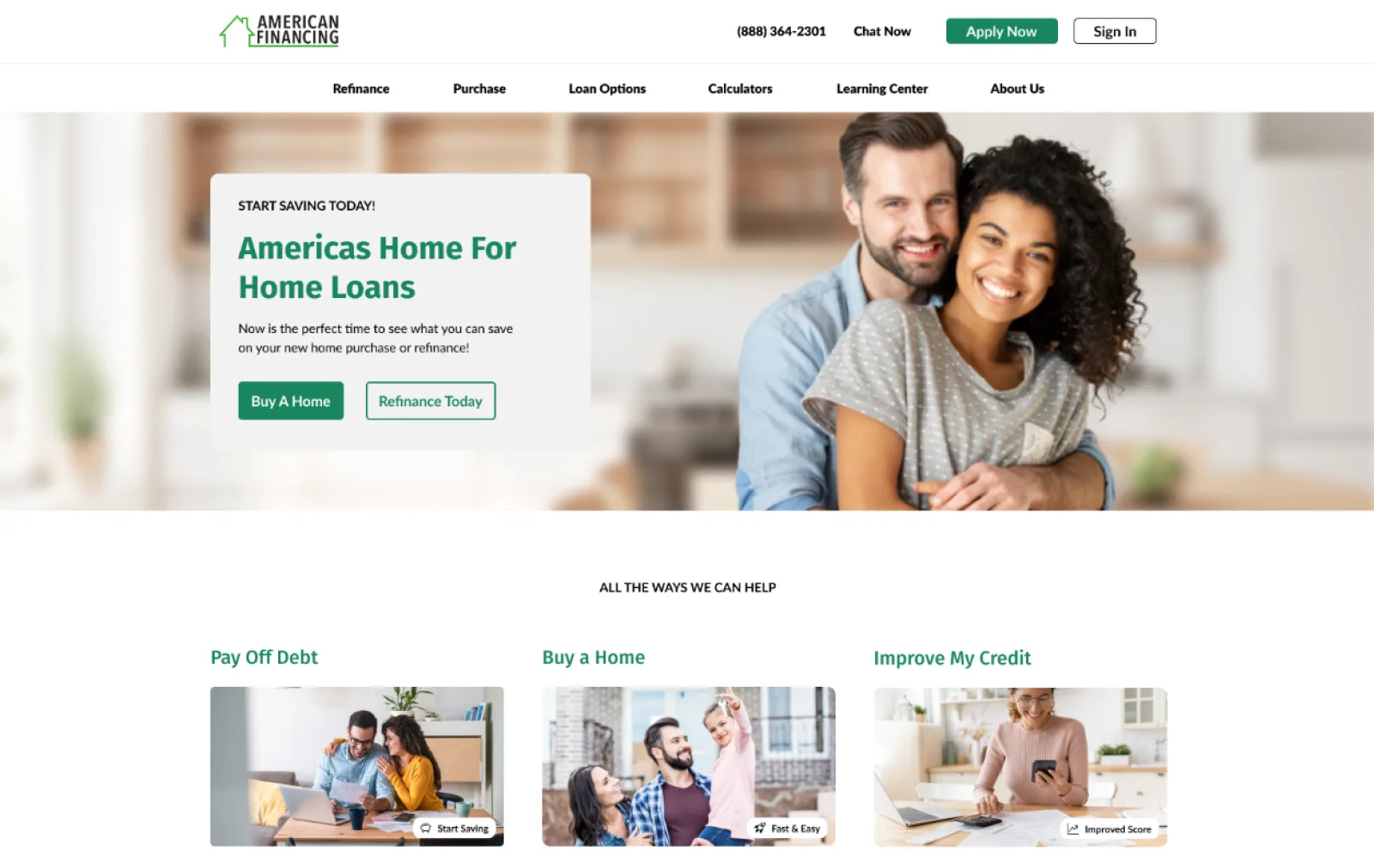
The old site was blocky and squared off. I moved the whole system toward rounded forms (corners, cards, buttons), which reads as friendlier and more current without touching structure. On the home page I organized entry points around the visitor’s goal rather than the product catalog: Pay Off Debt, Buy a Home, Improve My Credit, each with warm photography.
Fixing the color the right way
The brand colors didn’t pass WCAG AA contrast for text. I rebuilt the palette so it stayed unmistakably on-brand while clearing the required ratios, rather than just darkening things until they passed.
The mega menu as a marketing surface
I replaced simple dropdowns with an integrated mega menu: every item gets an icon and a one-line description, and the panel carries a promo card and an Apply Today call to action alongside navigation. It collapses into a coherent mobile version too.
Humanizing the calculators
The calculators were ambiguous and chart-heavy. I simplified them into plain inputs with tooltips and a conversational headline, and instead of a chart, showed the answer that matters, large and human: “You could pay off your mortgage 5 years & 3 months early.”
Surface the payoff, not the math.
Case study
Landing pages, tested
The problem
The landers leaned on plain text and basic buttons that felt like the early 2000s, and the form behind them asked for too much: four steps where two would do. Every extra step is a place to lose someone.
Cut the form in half
The biggest lever was the form itself. I collapsed four steps into two: pick purchase or refinance and a state, then go.
Headers that feel like home
Header backgrounds matched the visitor’s geography. Florida got a bright beachside scene; Colorado and Texas got their own, with people who look like they belong there. Paired with a benefit line of eight words or fewer, the page feels local before the visitor reads a word.
A trust thread through the form
A quiet row of reassurances (Secure Form · Only Takes 1 Min · No Upfront Fees) sits above the fields, and a simple progress component follows along, ending on a success screen that offers a Call Now button and call-center hours instead of a dead end.
Case study
The borrower portal
What it was
Warning red was the primary button color, used for routine actions. Elements were misaligned. An eight-step progress bar ate the top of the screen, most fields read “Pending,” and document requests stacked vertically into endless scroll.
Start at the front door
A split-screen login pairs a clean, on-brand sign-in with a warm welcome panel and a Google sign-in option. The first screen of a stressful process should feel reassuring, not transactional.
A dashboard you can read at a glance
The dashboard became four blocks: an Action Center that narrows eight steps to the three a borrower can act on, the application details, progress, and the appraisal. Progress is a single circle (“30% complete · Step 3 of 10”) with a pill for the current step and a pointer to the next.
Documents you scan by icon
Upload blocks became a card grid, each with an icon for its document type. A green check means uploaded or approved; a red ✕ means it needs attention, with a replace button right on the card. You can scan the whole grid and know what needs you without reading a label.
Warning red went back to its real job: errors only.