Case study · Digital leadership
VNA Texas
For nine years I owned every digital channel at the Visiting Nurse Association of Texas: web, email, donation campaigns, social, brand photography and video, reporting to senior leadership.
Overview
Nine years of digital, end to end
- 10–15% year-over-year online donation growth across multiple fundraising channels
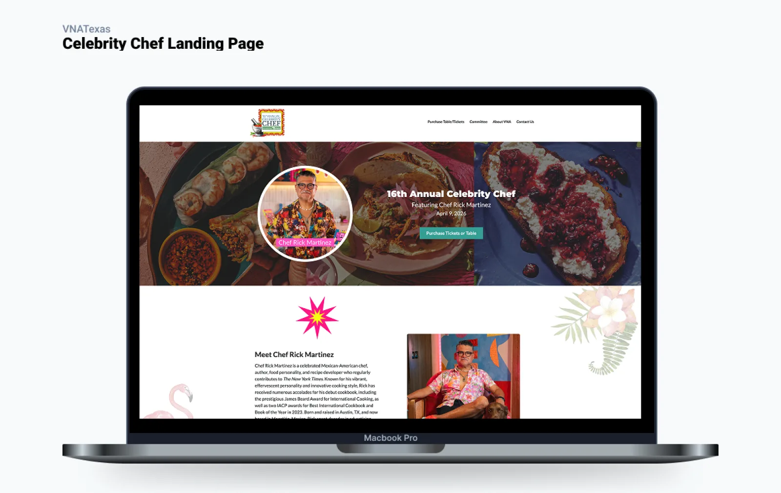
- Digital execution for the annual Celebrity Chef fundraiser as it grew from $480K to $550K
- A 35,000-subscriber email program with a 5–15% yearly lift in open rates
- Led the launch of the volunteer.vnatexas.org platform
Case study
Rebuilding a checkout I couldn’t edit
The constraint
VNA runs donations and event commerce on Luminate (Blackbaud). It’s powerful, but its product and checkout pages are built on hard-coded HTML tables that don’t hold up on mobile, and you’re not allowed to edit the platform’s source.
Why it mattered
Celebrity Chef is VNA’s flagship fundraiser, selling sponsor tables up to $75,000 alongside individual tickets. A growing share of buyers arrive on a phone, and a cramped desktop-only checkout is friction at the exact moment someone is trying to give.
Changing the page at runtime
Since I couldn’t touch Luminate’s code, I injected a script that runs as the page loads, strips the old table markup and rebuilds the layout as a responsive product catalog and checkout, without changing a line of the platform. The inspector still shows Luminate’s tables underneath; buyers see a clean, responsive card grid.
The result
Buying a table or a ticket works as well on a phone as on a desktop. The event grew from $480K to $550K thanks to the chefs, the cause, the sponsors and a whole team; my piece was making the buy-in smooth, modern and mobile.
I couldn’t change the platform, so I changed what the user experienced.
Case study
A volunteer platform for one hand on a porch
My role
I owned the requirements, design coordination and rollout of VNA’s Meals on Wheels volunteer platform. My job was to sit between stakeholders, who wanted to capture as much as possible, and volunteers, who needed something they could actually use.
The user nobody designs for
Meals on Wheels volunteers skew older and less technical, and they use the platform mid-delivery: one hand on a phone, standing on a porch, with a homebound senior waiting. Every screen was a negotiation between the organization’s appetite for data and what a volunteer could do in that moment.
Showing a route isn’t enabling one
The portal showed each delivery route as an embedded map. It looked useful, but a static map can’t navigate you. My recommendation was to hand volunteers into live Google Maps directions on their phone, with turn-by-turn, voice and rerouting in an app they already trusted.
A thousand small negotiations
Most of the work was quieter: button flow and placement, how many fields a step could hold, how big a tap target needed to be for an older hand. Together, that’s the difference between a portal a volunteer dreads and one they barely notice.
Showing information isn’t the same as enabling the task.